

Comparative Usability Testing:
APPLE MUSIC & SPOTIFY


Persona
Young Adults
To run our UX research test on Spotify & Apple Music, we observed 5 participants, specifically targeting the demographic of college students.
During the session, they completed multiple tasks on both mobile apps while recording results and reactions.
STRENGTHS
PAIN POINTS
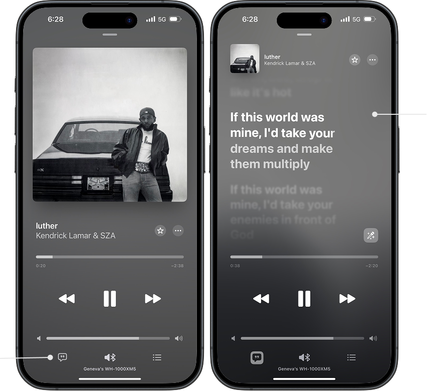
lyrics button
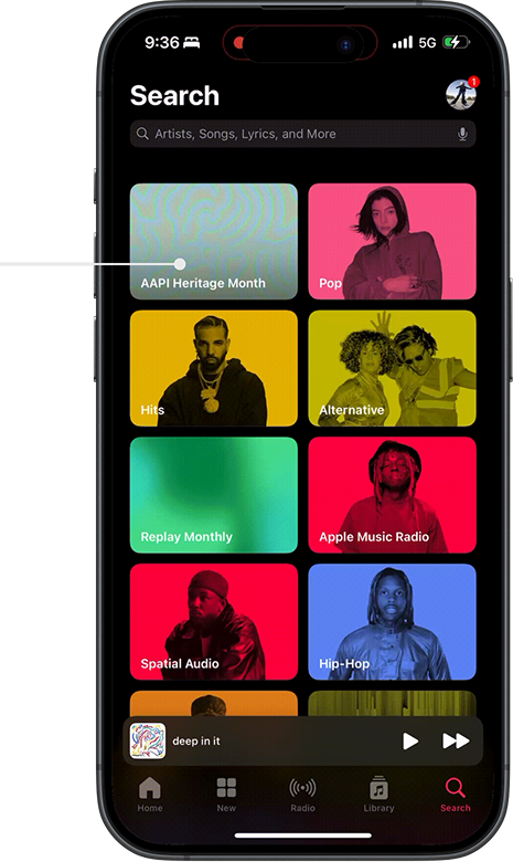
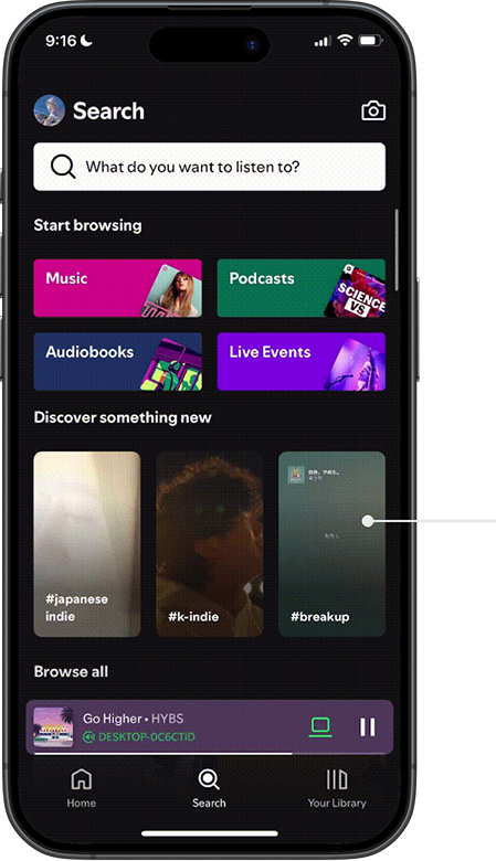
List of genre options
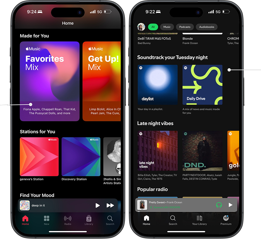
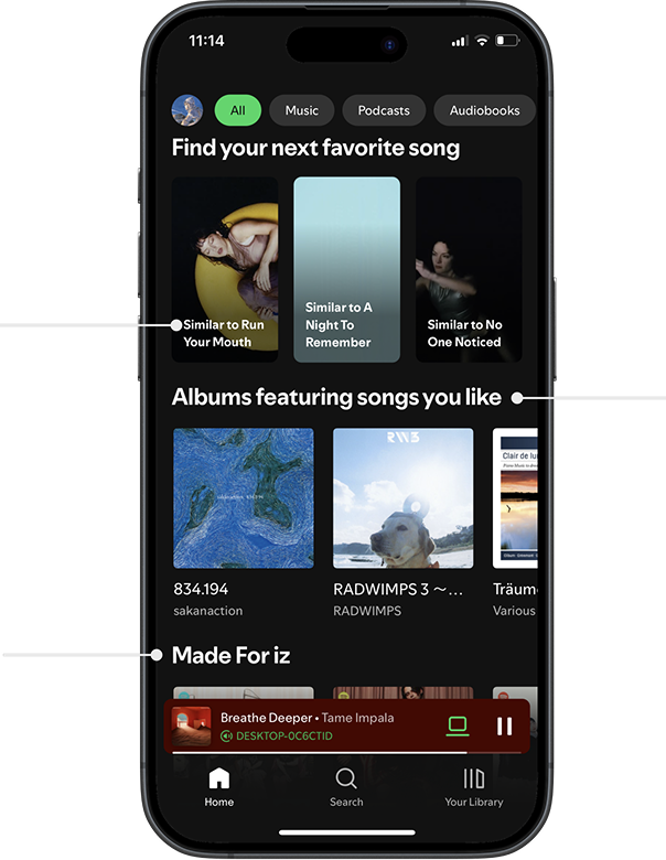
Apple Music Discovery Features
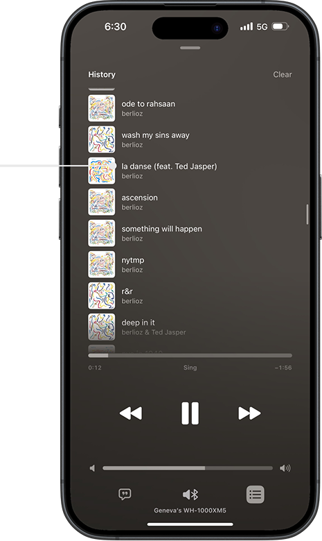
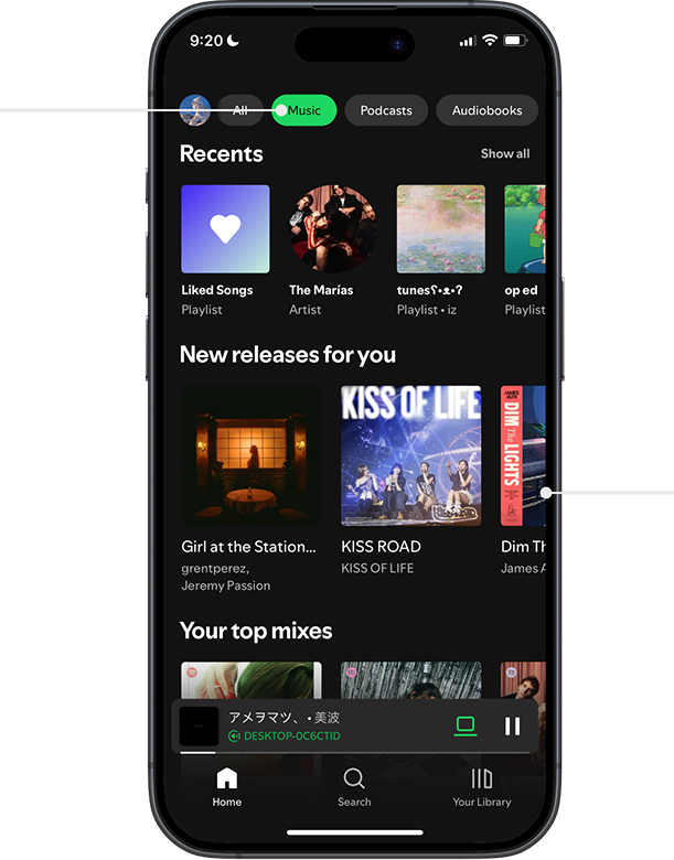
Listening history
lyrics
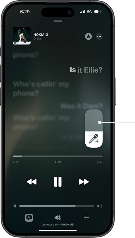
Karaoke button
that turns down
the vocals
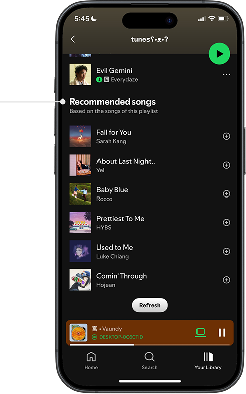
Spotify Discovery Features
STRENGTHS
PAIN POINTS
Spotify’s curated playlists
Recently released music recommendations for the user
Spotify’s green & black color palette
Similar song recommendations
More user
curated playlists
Limited filter options
Suggested playlists & artists based on user’s listening activity
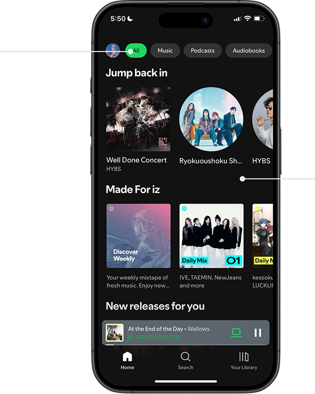
Dark background against colorful playlists and artist profiles
Albums with already known songs
Too much content to scroll through
General “Music” filter
Spotify excels in personalized music recommendations and visual design, but suffers from a cluttered interface and difficulty browsing new genres.
Test Session 1: 04/20/2025


Objectives
Test the Apple Music and Spotify apps among young adults.
Discover revealed points of confusion when completing tasks.
Identify navigation issues and feature preferences within both music apps.
Compare navigation issues and feature preferences between Spotify and Apple Music.
What Changes could overall improve Apple Music and Spotify’s user experience.
Methodology
Pre Test Questions:
How often do you listen to music?
Do you use any streaming Services, and if so, which one do you use?
Do you use any other methods to listen to Music?
Create a new playlist, name it, and add a song to said playlist?
Overview
My team and I conducted a usability test to evaluate how easily users navigate Apple Music and Spotify on mobile and desktop platforms. Participants were asked to complete tasks such as creating/finding a playlist and locating song lyrics.
Spotify – Key Findings
Lyrics Access: Easy to find on mobile, the majority of users located the icon immediately.
Interface Design: Users felt the main interface felt cluttered and confusing.
Playlist Creation: Spotify offered ample song suggestions that felt curated to the user’s music preferences.
Apple Music – Key Findings
Navigation: Most users found the interface intuitive and well-organized.
Icons & Features: Some icons and functions were unclear to a few participants.
Unique Features: Karaoke mode was well-received, though users wanted more curated music suggestions.
Apple Music vs. Spotify – Summary Comparison
Apple Music excels in organized UI, intuitive playlist tools, and unique features like karaoke, but falls short in automatic music discovery and browsing.
Spotify excels in personalized music recommendations and visual design, but suffers from a cluttered interface and difficulty browsing new genres.
Tasks: (conducted on mobile application)
Create a new playlist, give it a name, and add a song to it.
Find a pre-made Hip-Hop playlist, then save and download it for offline listening.
Locate the playlist you created earlier and play the song you added.
Play a song of your choice and find where the lyrics are displayed within the app.
Further Questions:
If you haven’t used Spotify before, would you consider trying it? Why or why not?
What factors would motivate you to switch from your current music platform to Spotify?
Why do you currently use Apple Music instead of other streaming platforms?
Usability test findings for Apple Music
Strong User Interface (UI)
Described as organized and better separated than Spotify
Playlist creation and navigation felt intuitive
Lyrics were easy to locate
Unique & Enjoyable Features
Karaoke feature praised by all users (including Spotify user)
City charts and mood categories stood out
Listening history made it easy to revisit liked songs
Weak Curated Music Discovery
New curated music was hard to find without manual search
Discovery felt less intuitive than Spotify
Discovery features don’t always match similar music
“With Apple Music you have to search for new music in order to discover it.”
Some Interface Issues
Adding to playlist also downloads to library
Genre list felt long, overwhelming, and confusing to scroll through
“It’s hard to tell if it’s an album or a playlist.”
Usability test findings for Spotify
Recommended songs curated for your playlist
Easy Playlist Creation
The suggested songs feature is helpful for
discovering new songs to add to playlists
Curated Music
Users receive curated playlist and song recommendations on their home page
Interface/Brand Aesthetics
Recognizable color scheme throughout its user interface
Contrasting dark background and bold content colors
Discovering New Music
Curated music content made it difficult to discover new music outside of the user’s usual listening habits
Interface Structure
Mobile app interface is too cluttered
“Discover page has too many tiles, it was information overload.”
Interface Organization & Visible Content
Lack of filter options to organize content on the home page
“Podcasts are the second filter option even though I never use it. It is very annoying.”
How do they compare?
Apple Music excels in organized UI, intuitive playlist tools, and unique features like karaoke, but falls short in automatic music discovery and browsing.
Actionable Recommendations
Maintain an organized UI
Users consistently described Apple Music’s interface as more structured than Spotify making it easier to navigate.
Continue emphasizing separation between content categories.
Enhance and promote unique features
Karaoke mode, city charts, and mood categories were standout features -- even to Spotify users.
Continue spotlighting these exclusive features in marketing to attract new users.
Fix the music discovery experience
Users felt that music discovery was effortful and less intuitive compared to Spotify
Improve the recommendation algorithm and add auto-generative features to compete with Spotify’s “Discover Weekly” and “Daily Mix”
